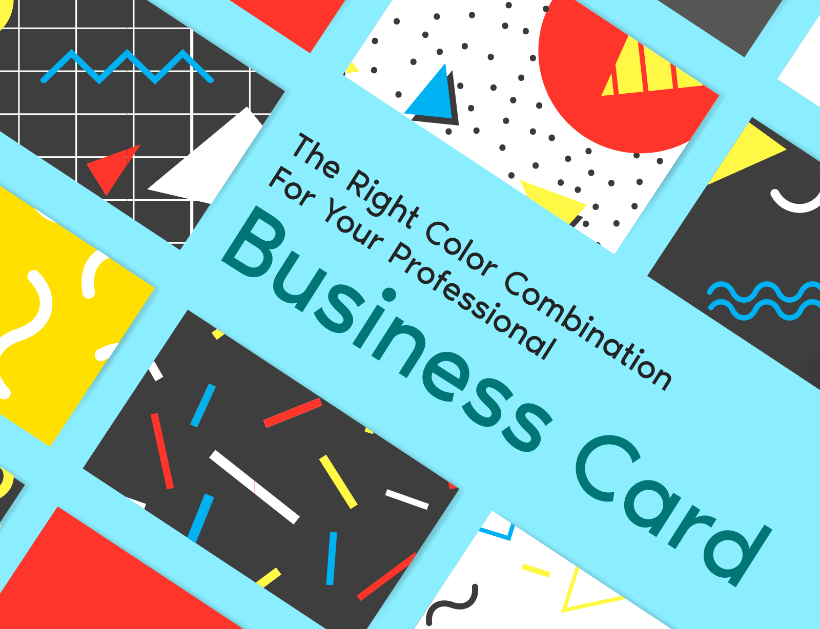
The Right Color Combination For Your Professional Business Card
The two very primary questions that may pop in one’s head when deciding on designing a personal business card are: –
a) what’s the business that you’re running (DJ, Event Planning, Swimming Instructor, Marketing, Real Estate)
b) whether you’re targeting a certain type of audience or not!
Event Planning Companies
Let’s be straight. There are all sorts of event/wedding planning companies out there! For starters, there are the ones who believe that adding exotic colors would make your event truly memorable, where everybody would be in awe while on the other hand there’s a lot of planners who believe in subtle designs & the notion of “less is more”. Whatever mindset you have for your business from the very start (an enjoyable, energetic, full of entertainment or serious work space) is what you should be expressing via your professional business card! Not to forget the fact that a very colorful vibrant card may give a vibe of childish or a newly formed company! While if the card looks sleek, stylish, chic with the right amount of colors added at the right spots – it may look way more professional or a more dependable company!
Why Right Colors Are So Important?
Let’s learn a fact or two that where your clients are coming from, what are their expectations & what’s the first impression your business card can have on them!
Though this may not seem that prudent or of much significance but the choice of font, texture of the card and the base color greatly matters.
Your client may examine the card & the font color being too light might not be visible to someone who’s not blessed with a perfect vision!
Simultaneously, the base color being too dark, let’s say black or charcoal may not strike some at first! They may even think “if their business card looks so absurd, imagine their services & quality of work”.
As the client has to invest his money in your services i.e. for example if you run a carpet cleaning company your card should not be bursting with exaggerated colors. It should be plain with one of two carpet pictures & a very catchy yet brief slogan/description at the back. Too much floral design on the side or bright colors might not work in your favor! Some might throw away your business card calling it “a circus invite” or “this company seems non-serious”!
What Colors Should I Choose For My Business?
Whether you’re running a law firm, you’re a mechanic, a doctor or even a banker; know that for some professions it is nearly impossible to insert a tiny bit of humor or extra tint of colors as the person might lose their credibility in literally a nanosecond! Likewise, there are countless ways of making your card modern & smart that speaks for itself & that’s where Professional Business card designers’ steps in. Without transgressing their limits & without making it look cheap, they know all the tricks in which your card – where you happen to be just another banker in the city wouldn’t look unprofessional! From Ombre designs to utilizing minimalist nudes, there’s nothing that a seasoned Card designer Won’t be able to achieve!
Colors & Fonts – Mistakes To Avoid
Several times you’d see a business card but the font might be too cute or in other words reminds you of the big bubble writing in children’s book! Note that there are certain fonts that you should never ever select for your card as they’d instantly be a turn off for a client who’s not just judging an ordinary card but in simple words your whole company!
You don’t want to disappoint highly professional individuals who’d except a captivating business card! What can you say – people will make notes about your work from every little detail!
Apart from the font, nude shades, beiges, off white, baby pink, light mint green, ice blue & light peachy colors can really look phenomenal combined with a contemporary font. Undoubtedly that can really put a smile on the client’s face. He/she might start trusting you before even meeting as your very card gave them positive vibes. How convenient would that be to meet someone who has already started trusting you with your services!
The best thing about light colors is that when you add a black, bronze golden or silver boundary, it instantly looks more prominent & the onlooker may not consider any other company but Yours!
Decide Now – New Business Card or Not?
A word of advice is that unfortunately, even when sometimes things slightly go south between clients & the service providers, you company might not be recommended to other people based on
- What went wrong?
- Your Business Card would be surely looked down upon!
Maybe it’s high time you have a look at your business card. Is the base color too loud?
Is this font selection correct which is visible to me but the color might be barely visible for someone who wear spectacles?
If it has not done any good in creating a lasting impression on the audience, it’s should be revamped without delay!